
Overview.
위의 ClipRRect , ClipOval , ClipPath 에 대해 알아보자 세가지 한번에 말하자면 도형을 어떻게 만드는 지 이다.
- ClipRRect
- ClipOval
- ClipPath
- 라이브러리 사용
0. 문서
https://api.flutter.dev/flutter/widgets/ClipRRect-class.html
ClipRRect class - widgets library - Dart API
A widget that clips its child using a rounded rectangle. By default, ClipRRect uses its own bounds as the base rectangle for the clip, but the size and location of the clip can be customized using a custom clipper. This example shows various ClipRRects app
api.flutter.dev
https://api.flutter.dev/flutter/widgets/ClipOval-class.html
ClipOval class - widgets library - Dart API
A widget that clips its child using an oval. By default, inscribes an axis-aligned oval into its layout dimensions and prevents its child from painting outside that oval, but the size and location of the clip oval can be customized using a custom clipper.
api.flutter.dev
https://api.flutter.dev/flutter/widgets/ClipPath-class.html
ClipPath class - widgets library - Dart API
A widget that clips its child using a path. Calls a callback on a delegate whenever the widget is to be painted. The callback returns a path and the widget prevents the child from painting outside the path. Clipping to a path is expensive. Certain shapes h
api.flutter.dev
https://pub.dev/packages/flutter_custom_clippers
flutter_custom_clippers | Flutter package
Flutter package that provides you custom clippers to help you achieve various custom shapes.
pub.dev
1. ClipRRect
이 놈은 borderRadius 와 같은 역할을 한다 한마디로 네모난 각진 부분은 둥글게 처리를 해준다. 그게 끝이다 ㅋ..
borderRadius 를 사용하여 둥글게 만들어 줄 수 있다.

import 'package:flutter/material.dart';

/// Flutter code sample for [ClipRRect].

void main() => runApp(const ClipRRectApp());

class ClipRRectApp extends StatelessWidget {
  const ClipRRectApp({super.key});

  @override
  Widget build(BuildContext context) {
    return MaterialApp(
      home: Scaffold(
        appBar: AppBar(title: const Text('ClipRRect Sample')),
        body: const ClipRRectExample(),
      ),
    );
  }
}

class ClipRRectExample extends StatelessWidget {
  const ClipRRectExample({super.key});

  @override
  Widget build(BuildContext context) {
    const TextStyle style = TextStyle(color: Colors.white);

    return Center(
      child: Column(
        mainAxisAlignment: MainAxisAlignment.spaceEvenly,
        children: <Widget>[
          Container(
            alignment: Alignment.center,
            constraints: const BoxConstraints(
              maxWidth: 300,
              maxHeight: 100,
            ),
            color: Colors.blue,
            child: const Text('No ClipRRect', style: style),
          ),
          ClipRRect(
            borderRadius: BorderRadius.circular(30.0),
            child: Container(
              alignment: Alignment.center,
              constraints: const BoxConstraints(
                maxWidth: 300,
                maxHeight: 100,
              ),
              color: Colors.green,
              child: const Text('ClipRRect', style: style),
            ),
          ),
          ClipRRect(
            borderRadius: const BorderRadius.only(
              topLeft: Radius.circular(10.0),
              topRight: Radius.circular(20.0),
              bottomRight: Radius.circular(30.0),
              bottomLeft: Radius.circular(40.0),
            ),
            child: Container(
              alignment: Alignment.center,
              constraints: const BoxConstraints(
                maxWidth: 300,
                maxHeight: 100,
              ),
              color: Colors.purple,
              child: const Text('ClipRRect', style: style),
            ),
          ),
        ],
      ),
    );
  }
}
2. ClipOval
다음은 ClipOval 이다 음.. 쉽게 말하자면 원형을 만들어 줄 때 사용한다.
밑과 같다. 사진은 취향이다

            // ClipOval
            // 동그란 모양
            ClipOval(
              child: Image.asset('assets/image.jpeg'),
            ),
3. ClipPath
아마 이녀석이 제일 그럴 거다..나도 아직 잘 모른다. 일단 보고 설명하자

보이 십니까.. 각진 녀석을!! 엌.
네 한마디로 선 긋기가 가능합니다.
바로 코드로 보시죠. 밑과 같이 class 를 활용하여 CustomClipper<>를 구현을 해야합니다. getClip과 shouldReclip 을 무조건 구현해서 사용하는데 getClip 부분에서는 선을 그을 수 있고 shouldReclip은 뭐 그냥 true 로 하면됩니다. 핫 리로드시 적용 되게 할거냐 그정도라
getClip 에는 Size 매개변수를 받는데 해당 ClipPath 의 width 와 height 를 가져올 수 있습니다. 그 외 등등 있겠죠
Path 객체를 생성하여 moveTo 와 lineTo 를 사용하실 수 있는데 moveTo는 어디서 부터 선을 그을 것인지, lineTo는 선을 그어버리는것인데 아무래도 잘 모르겠죠..? 뭐 일단 skip 하고 넘어가죠 넘어가~
// ClipPath
// 독특한 모양을 커스텀으로 만들고 싶다면 ClipPath 를 사용
ClipPath(
  child: Image.asset('assets/image.jpeg'),
  clipper: MyCustomClipper(),
),


...

// getClip 과 shouldReclip 은 반드시 구현해야함
class MyCustomClipper extends CustomClipper<Path> {
  @override
  Path getClip(Size size) {
    // TODO: implement getClip
    Path path = Path(); // Path 객체 생성
    path.moveTo(0, 0); // 선을 어디서 부터 그을건지.
    path.lineTo(size.width, 0.0); // 선긋기
    path.lineTo(size.width, size.height); // 선긋기
    return path;
  }

  @override
  bool shouldReclip(covariant CustomClipper<Path> oldClipper) {
    // TODO: implement shouldReclip
    // 바로 핫 리로드 반영이 될것인지
    return true;
  }
}
4. ClipPath 외부 라이브러리
그럼 우리는 뭘 해야하나?
당연 라이브러리를 써야죠 엌ㅋㅋㅋ
flutter custom clippers 라는 라이브러리를 사용해봤습니다. 나머지는 들어가서 확인시면 되니 이만 코드만 던지고 끝!
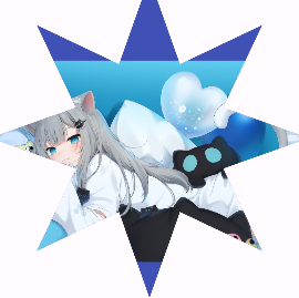
            // 라이브러리 사용
            ClipPath(
              clipper: StarClipper(8),
              child: Container(
                height: 450,
                color: Colors.indigo,
                child: Center(child: Image.asset('assets/image.jpeg')),
              ),
            ),
아주 편안 하구만

'flutter & dart' 카테고리의 다른 글
| flutter & dart - alert 창과 같은 Dialog (0) | 2024.04.01 |
|---|---|
| flutter & dart - 버튼 활성화와 비활성화 AbsorbPointer (0) | 2024.04.01 |
| flutter & dart - ListTile 위젯 (0) | 2024.04.01 |
| flutter & dart - RichText (0) | 2024.04.01 |
| flutter & dart - ListView.builder (0) | 2024.03.21 |